Why Your Landing Pages May Not Be Working
Whether you’re involved with PPC, SEO, email marketing or social media, the landing page can make or break the odds of a campaign succeeding. You can drive a lot of traffic, but if your landing page doesn’t convert then what’s the point? A 25% CTR and 400% traffic increase doesn’t look great if the return was minimal. Third party landing page tools can help improve your conversion rates, but if you don’t know what to do with them that won’t help you either. If you’re having trouble converting with your campaigns, here are a few actions you might be doing which could hinder performance.
You Have Too Many Action Points on the Page
Your landing page should have a single, clear, defined call to action. The user should be able to understand immediately what they should do on the page. Here’s one example of a landing page for the search term, “cnc machining.”
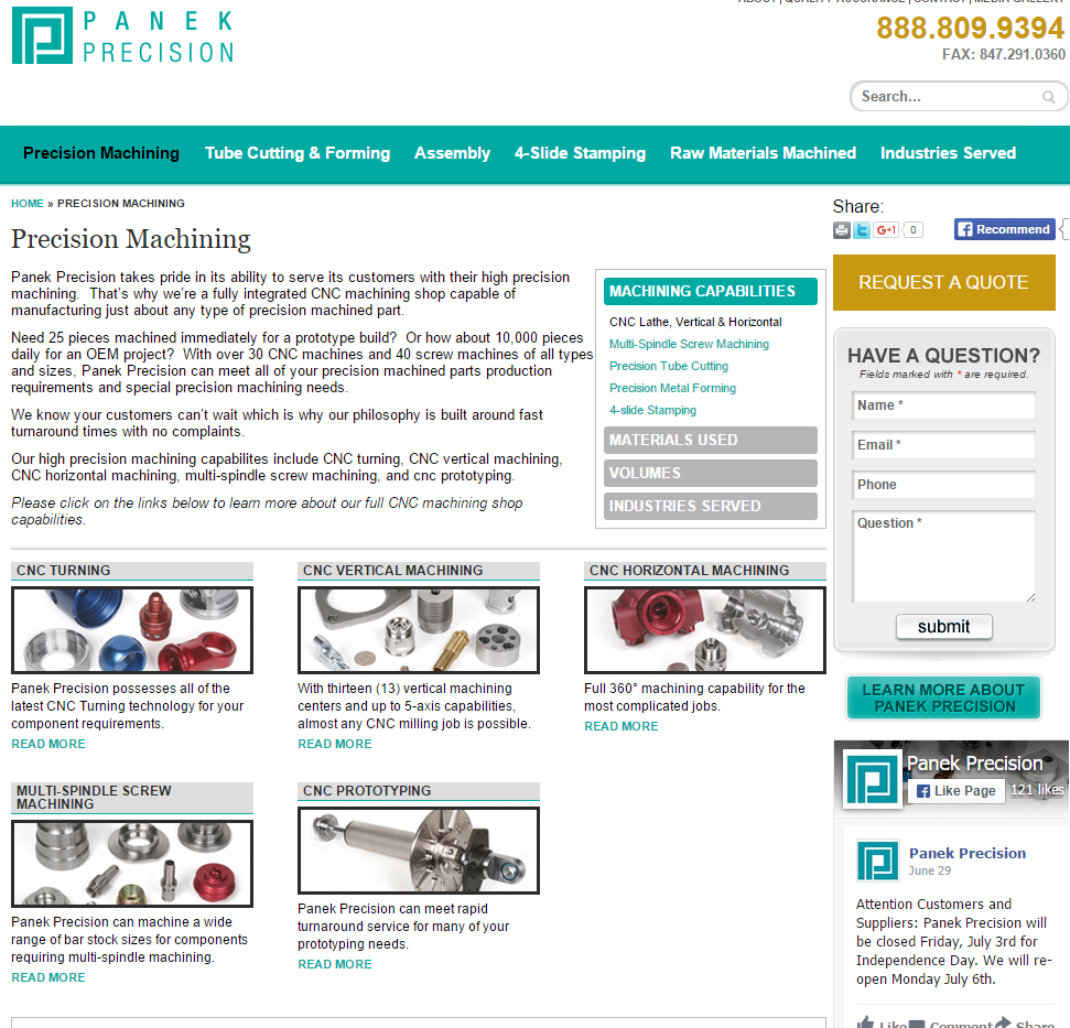
Look at the righthand column. I cannot tell what action is the most important goal for this business. Here’s a list of possible actions a user could take if they land on this page.
- Call them
- Fax them
- Print or share the page on Twitter or Google Plus
- Recommend them on Facebook
- Request a quote
- Ask a question
- Learn more about the company
- Like their page on Facebook
Wow. And that’s not including all of the internal links to other pages taking up more real estate than the topic I searched for. I would guarantee all the noise on this page is hurting conversions and conversion rates. Do you really want people to like your social media pages instead of sending you a quote? Maybe if you provide a great customer experience, they’ll naturally like your social media pages. Take a look at a different landing page for an ad that showed up under the same search term.
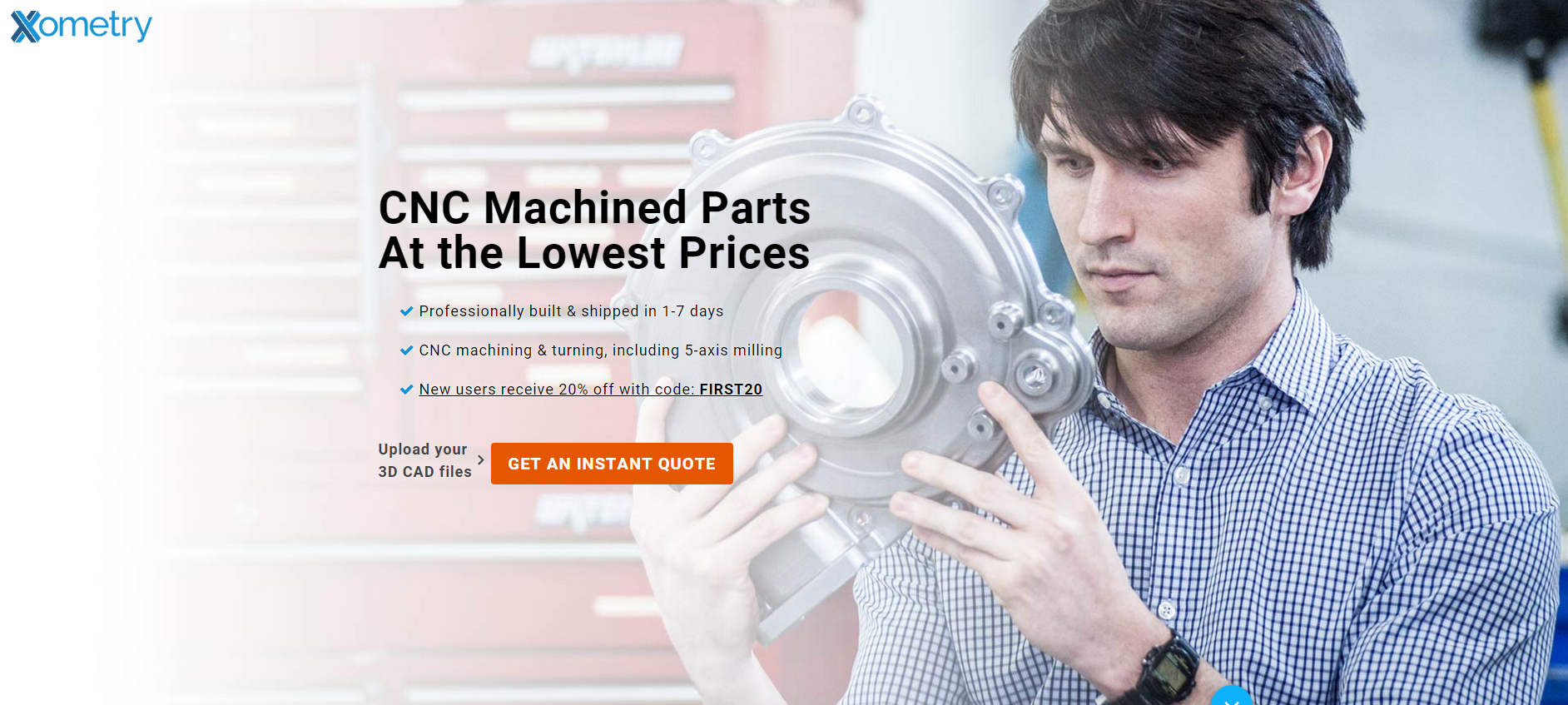
You see a headline connecting with my search query. You see simple, value-based content. Then one action point that’s very easy to see. The only action a user can take on this page is convert.
Your Images Don’t Connect with What You’re Trying to Sell.
I cannot remember how many times I’ve seen an attempt at emotional branding get in the way of successfully capturing the product this company is trying to sell. Here’s an example.
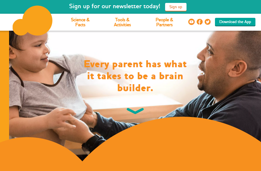
I typed “kids learning software” into Google, and the image you see above was the landing page for the ad in first position. This visual includes everything I could see above the fold. Now I understand the direction here. They want to emotionally connect with parents and show a pleasant time. The only problem is that I looked for software, and there isn’t anything in the image or the text mentioning software. The product does exist on the page, you just have to scroll down to see it. If I was running this landing page, I’d have picked an image of the parent sitting with the kid using the learning tools together as a fun bonding experience. You’d still get the psychological connection, you’d still get the branding, but then we’d get to see what the product actually looks like. No second guessing. Immediate user connection.
If you’re still using stock photography on your landing pages. Stop. Immediately. Stock photos are hurtful to your marketing campaign because they can build distrust. If the people on your website aren’t real employees or customers, then what else on your landing page are users going to perceive as fake too? Here’s part of a landing page I got for a company after searching for “accounting services.”
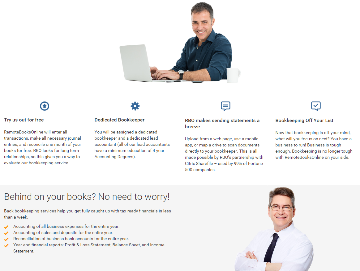
A photo of a man standing with his arms crossed and smiling helps sell accounting right? No. No it doesn’t. These visuals have no relation to the company or service being offered. And since visuals capture attentions over words, this site is directing people’s eyes to unrelated images instead of the content that will convince the user to convert. At least a person wearing a company polo would be more believable than what’s seen above.
Last, if Vince Vaughn and his fellow cast members of the movie Unfinished Business think it would be a great punchline to recreate a few stock photography images as a great promotion to the movie, then you shouldn’t do it either.

These photos were funnier than the actual movie!
You’re Proposing Before the First Date
I’m talking about email popups. One of the worst things you can do is scare off someone before they decided what they wanted to do on your page. It makes perfect sense to have the newsletter popup appear on a landing page where you know people are coming in on branded search terms. They’re already familiar with your business or products so it makes sense to capture this type of user. However, what if a user is in discovery mode and not ready to buy yet? The popup can possibly turn the user off from wanting to find out more information on what you offer. Why would they give up their contact information to a complete stranger? You’re asking for the customer’s commitment before they even had a chance to find out what you have to offer.
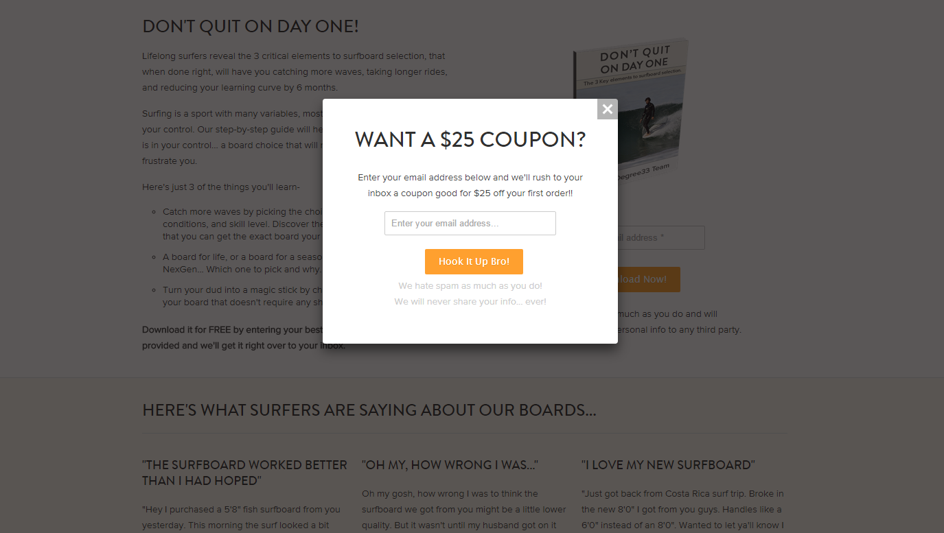
Now I know what you’re going to say. You’re going to tell me, “but they work!” My response is going to be, “Are you sure?” Actually take the time and research if these popups are actually doing anything for your business.
- Figure out how long the user needs to be on your landing page before the popup appears. Then check your Analytics to see how long people are staying on the landing page. Compare the timing of the two to see if people are bouncing because of the popup.
- Even if you get a lot of signups, what’s your average open rate for email campaigns? Out of the people who actually read your emails, how many of those readers convert? If your email conversion rates are far worse than your other online marketing campaigns, why would you want to hurt the performance of your other campaigns which may already be strong?
- Create a duplicate landing page and 50/50 test to see which landing page gets the better results: the one with the popup or the one without?
You Don’t Show WHY Someone Should Convert
When searching for “new forklifts” I clicked on the first ad in the SERPs and got this landing page…
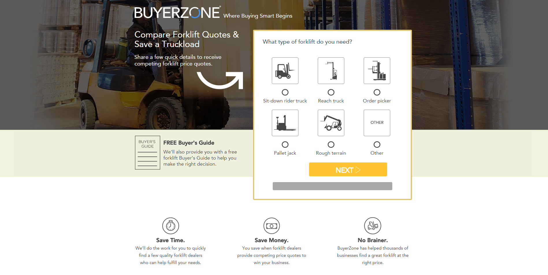
What makes this page so great? It doesn’t waste any of my time explaining what a forklift is or what kind of forklifts are out there. Why? Because odds are if someone is looking for a forklift, they already know that information already. This page is simple and loaded with value points on why I should use Buyerzone to find a new forklift. They’re giving me a FREE (who doesn’t love that word?) Buyer’s Guide. They explain how I’ll save save time and money to help my business. Then they offer a simple tool to find my exact needs. Done. Sign me up.
Another way to show why someone should choose you is by bragging about yourself…

This example gives both a list of notable clients they’ve worked with as well as four testimonials. This is a huge trust builder. If I see a company has worked with Bose, Target, Nintendo, Best Buy and more, I know they are good at what they do. Adding on testimonials from actual customers also proves other people are satisfied with your product or service. These trust elements will have much more value than paragraphs of content that the user won’t read. If your targeting is already solid, you shouldn’t need to explain what you do. You need to show a potential customer why you’re the best.
Start Reviewing Your Landing Pages
Whether you use a third party landing page tool or not, successful landing pages all come down to one thing: user experience. You can have the perfect keyword targeting in the world, but if your landing page doesn’t connect with your target audience be prepared to lose a lot of money. Step in your users’ shoes and deliver the experience that will convert. Give your users all the answers they need and all the reasons they need to convert the first time. Last, make the action you want your users to take clear and easy to find. Keeping your customers happy will help build your brand and grow your business better than ever.