WUT YOU SAY? 5 Tips Guaranteed To Better-ize Your Digital Writing
Every day, one of my best friends and I started our conversations with “how are you?” Of course, the next person gives the obligatory “good, but tired/busy/stressed. How about you?” AND IT’S DRAINING.
I love talking to this friend, but this opening takes all of the interest out of our conversations. And then I remembered an old friend of mine always started every conversation with, “What’s new and exciting?” It was a better way of starting the same conversation, so I switched it up. I started asking better questions, and these questions led to better, and more fun, conversations.
Similar to how asking better questions can lead to better conversations, writing better digital content can lead to clearer communication. This clearer communication can help you convey your points more efficiently, increase your readers’ understanding, and help your reader remember things.
This is especially important online, as most people aren’t actually reading your content, and are instead scanning your content.
By using these five digital writing tips, you can improve your writing and convey your point more efficiently.
1. Visually Guide Readers
When writing online, it’s important to visually guide your readers to your important information. Most of the time, people are scanning online and not fully reading. While there are many factors that play into how thoroughly users read content and how they scan your content, it is important to help them find the information they are looking for.
When writing online, use the following tactics and formatting techniques to help users visually scan and comprehend your content:
- Headings and subheadings
- Indents
- Text formatting (like bold and italic)
- Bullet points or numbered lists
- Boxes
- Whitespace
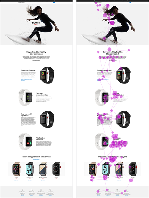
In the below example from Nielsen Norman Group, we can see how users scan the page, and how Apple visually guided the users through the page. The page utilizes heading and subheadings, and emphasizes these through bold text. Additionally, they use lots of white space, which draws even more attention to their content at the center of the page.
2. Use Visuals
Pictures aren’t just pretty. Humans rely heavily on visual information and can process visual information 60,000 times faster than they can process text. Because of this, readers tend to focus on visuals, as they can give them more information, faster, than they would be able to read it
3. Front-load Information
Have you ever looked for a recipe online? If you have, you’ve seen the recipe blogs, with long posts with an anecdote to draw readers in. And, it’s the worst part of the post! Many people include a “Jump to Recipe” link, as they know that’s what the reader wants. Our attention spans are getting shorter, and averaged only 8.25 seconds in 2015. Don’t hide your information and risk losing readers; help your readers by giving them the information they are looking for quickly.
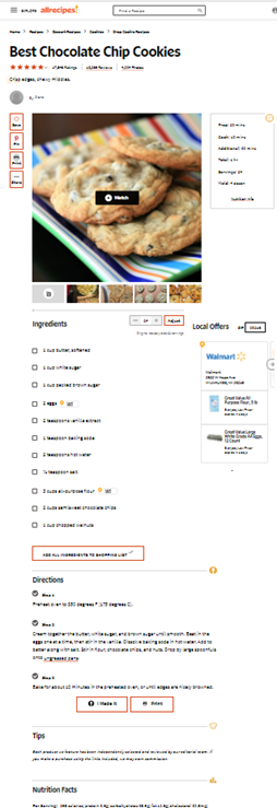
One recipe site that does a good job of prioritizing the recipe content is allrecipes.com. The top of the page goes straight to the ingredients and directions, which is the content users are looking for. Below the recipe, you can find tips, nutrition information, suggested recipes, and reviews. Comparing this to a favorite recipe of mine, Vegangela starts her blog off with a story about the soup, a lot of pictures, and after lots of scrolling you may find the recipe. By not front-loading her information, Vegangela risks her users deciding not to scan her content to find the recipe, and misses the opportunity to share her recipe more widely.
Have you ever started a book in the middle? It would be hard; you wouldn’t know the characters, the setting, and you wouldn’t understand references made to events that happened in the beginning of the book. Similarly, you can’t expect your users to come to your website or writing with the same level of knowledge as you. Give your users context; introduce your information, and if you can’t give all the introductory information, make sure to link to relevant information throughout your writing. This allows readers to easily find the background information they need, instead of giving up.
4. Give Users Context
News outlets do a great job of this. They typically start their stories with quick-and-easy to understand statements of what is going on, and link out to other relevant stories and information the user may need. Additionally, as you read past the main points, additional information is given that adds context to the story.
5. Be Brief
Have you ever listened to a bad storyteller ramble on and on, only to have the story be a huge let down that could have been told in just a few sentences? By being brief, we can pull attention to the most important information to convey. Additionally, readers will be able to better remember the important points, instead of distracted or put-off by all the other information.
Apparently, if you are a cute kid, not being brief can get you famous. But, as that’s what’s remembered about this kid and video instead of the question he was originally asked, we can see the importance of being brief.
Take a look at these two different ways to start a conversation…
“Good morning. How are you?”
“Hello you beautiful sunshine butterfly . What’s the next thing you are excited to do?”
In my experience, these two conversation starters lead to very different conversations. Similarly, you should be conscious of how users read online, and how to get the best result from your communication with them. Start with these five easy tips, and see how your digital communication transforms.


