5 Beginner Google Data Studio Mistakes We Wish We Hadn’t Made
At Granular, we used to use spreadsheets for our client-facing KPI reporting. This involved downloading data for every account we had, then molding it into charts and graphs that would be readable by a client. As our number of clients grew, this task became much more difficult. We had to find an automated solution that could combine all of the data. Moving to Google Data Studio has saved us a lot of time and allows us to easily provide reports to clients at any time.
We jumped into Google Data Studio with little experience and made a lot of mistakes that cost us time. We knew that moving to Google Data Studio would make our reports look better and allow us to show more data easily. But we made our lives more difficult than it needed by not knowing these five things.
Google Data Studio Lessons Learned the Hard Way
1) Report, Page, and Chart Level Filters
When we started using data studio for our reporting, we began using only chart level filters. This meant applying a filter across 9 scorecards and 4 graphs for every page across over a dozen pages for all of our client’s reports. That adds up to applying a filter 156 times which can take a lot of time. Starting to use report and page level filters has improved our efficiency in creating new reports because we only have to apply a filter a few times at most. And using filter across each level has allowed us to show our client’s the exact data they want to see with every report.
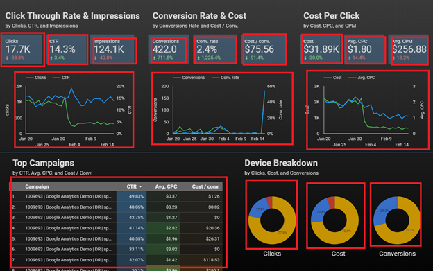
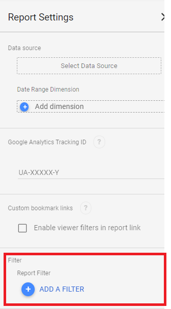
For example, on this report page, if we used chart level filters to only show data for search campaigns, we’d have to add the filter 16 times to each of the different charts, graphs, and scorecards here. If we’re using a page or report level filter, we can just add the filter once. The time savings when expanding this across pages and clients can add hours. You can find a report level filter by going to File > Report Settings. Then click on the Add a Filter button.
2) Chart vs. Data Source Formulas
We’ve found that we have to calculate a lot of information. Click through rate or cost per click can be incorrect if pulled straight from a platform and the information will be more accurate if it is calculated in Google Data Studio. There are two places you can create a calculation: in the data source or in a chart. If you calculate a formula at the chart level, then you’ll have to create that formula again every time you need to use it in another chart or graph. It is much easier to make a formula in a data source, then you can use that formula again and again without having to type it out.
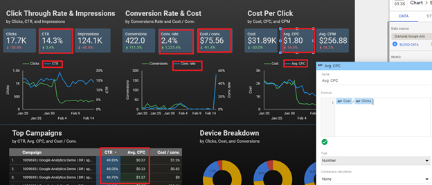
Making a formula in the data source saves a lot of time much like using page or report level filters do. In the example above, if we used chart level formulas, we’d have to write out formulas eight times on one page. If we had to do that across dozens of pages and all of our clients, that would add hours to report creation.
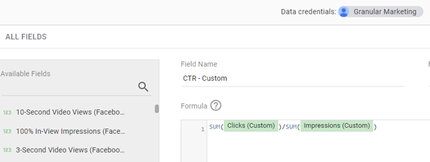
By making formulas in the data source, we only need to make the formula once. Go to your Data Source and click on the blue Add a Field button. Then your newly created formula will appear in the metric dropdown menu like any other metric.
3) Not being familiar with the limits of our Data Sources
We made the assumption that we could pull all of our data from Google Ads straight into Google Data Studio. Since they are Google products, they should work well together. This is not the case. We cannot pull certain campaign types like Local campaigns into Google Data Studio. We had to find workarounds like downloading the data into spreadsheets that can be imported into Google Data Studio to get that data into our reports.
4) The limitations of different types of data
Google Data Studio is not Excel (or even Google Sheets), but everyone thinks it should be able to act like Excel. Out of all platforms that handle data, Excel is the best at allowing you to handle data in a flexible way. Google Data Studio comes nowhere close to that. You have to define dimensions and metrics as numbers, percentages, geographic regions, periods of time, etc. And once you define a dimension or metric as a certain thing, then that handcuffs you on what graphs you can use in that data.
5) The best possible reporting always starts with the best possible tracking
If you’re pulling data from Microsoft Ads, then it is best to pull all of the data from Microsoft Ads. We’ve had instances where we pull our cost and click data from Microsoft Ads, then the conversion data has to come from Google Analytics because of poor Microsoft Ads conversion tracking. Because of this, we were unable to show our client’s keyword level conversion data for Microsoft ads. If you have to pull different bits of data from different platforms, then it will make reports less robust overall.
We all know hindsight is 20/20. If you’re a beginning Google Data Studio report builder, I hope this post has helped save you from making the same mistakes.
Looking for more info about reporting through Google Data Studio? Contact us and we’ll chat!
